This INTEAD insight is going to report on our learning. Have a look at our chart below. Over 50% of all emails were opened on a mobile device in December 2013 according to Return Path, a large email solutions provider. 27% were opened on a desktop client such as Outlook and 22% from a webmail client such as Gmail opened within a browser.
What does that mean for you and what does it mean for us? Well, let us tell you about our own experience. We relaunched our Intead Insight service on a new distribution platform last week. The technology provided by Hubspot is completely mobile ready (in contrast to many other content and email distribution technologies available).
The Hubspot system allows us to see how our email will look on different mobile device sizes in real time while we are writing and designing. Beyond email marketing, the platform provides for responsive design templates. This means that our webpages adjust to the screen size of the device displaying the text and images. Think of it as the columns moving around and adjusting automatically based on the device our visitors are using.
So, despite this new mobile responsive system, what did we do with our email marketing effort? (Hint: here is where our lesson is valuable to you). With our first email, we focused on what would meet our needs, not the reader's needs. We created a design template that would fit all of our charts displaying them across multiple columns. This design would look great when viewed from a laptop or desktop computer.
Here was one of the first email responses we received from one of our attentive readers.
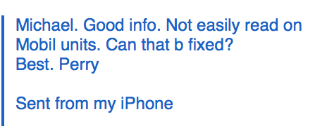
We paid a price for ignoring our own design rules and didn't test the new page layout on a mobile device. We had overruled and changed the templates to accommodate our needs and not the user needs.
Lesson for all of us.
- Ignore mobile devices at your own peril.
- All web activites have to be mobile friendly and mobile enabled.
Bottom Line: Have you looked at your website from a mobile device? From multiple mobile device types? Try navigating. Try finding some information.Try being an international student considering your institution for the first time. Did you give up?
And consider: if your website IS mobile ready, have you assessed mobile readiness of the marketing emails that drive your traffic back to your site?
Chart 1
