Maximizing Your Student Lead Conversion
According to Hubspot, 55% of visitors spend less than 15 seconds on your website. That isn’t much time, so you will have to make the most of it—that’s where we come in.
This week we focus on some basic digital marketing tips. We are bringing you a selection of landing page design and content approaches to increase conversion rates—the essential tools for effectively recruiting prospective students online. Landing pages can help you effectively drive visitors to fill out information capture forms or guide them to the most relevant section of your website. Well-designed landing pages can increase your chances of turning visitors into leads, and converting those leads into enrolled students.
Hit your target audiences with key, search optimized information and relevant offers; make the search easier for them, and the chance of conversion is higher for you.
This digital marketing lingo may be a bit intense for some of our academic readers. Chances are there is someone on your staff charged with making your website and your digital marketing work really well together. That person would really appreciate it if you sent them this post. It might simply confirm that they have their act together, or it might spark a few new ideas. And if that person is you, read on to get our take on how a strong landing page will increase your lead conversion rates.
We are big fans of the marketing automation offered by the Hubspot platform. There are other platforms that provide the same functionality such as Marketo, Act-on, and other options that are specifically designed (often not as well) for the academic world.
Marketing automation is a really important part of digital marketing. You can learn more about this at our NAFSA presentation all about selecting and implementing a CRM. Come see us and Megan Prettyman from Montana State University on Wednesday, May 31 at 1:15 pm. We'd love to share some LA sun with you.
So about optimizing those landing pages…
Your goal with every landing page is to spur a conversion – converting visitors to leads or prospective students. A landing page is used as a “middle-man,” supplying and collecting information.
The catch is that there is no inherent reason for visitors to fill out a form...unless you give them one. People have long been wary of giving out their contact information online. Your job is challenging.
To overcome this hurdle, we have a few guiding questions that might help you move forward effectively. Start by considering your visitors.
- Where are they arriving from?
- What does your institution have to offer in exchange for gathering new leads? – A campus guide? Student testimonials? Access to a useful webinar?
- Is your content offer directly relevant to the email or ad that drove them to the page in the first place?
Tying these messages together, providing an offer that is specific, relevant, and timely is vital to increasing conversion rates on your landing pages.
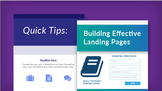
Every landing page should contain a minimum of 5 key elements:
- Headline: What is your offering? Something catchy, engaging—draw the reader in.
- Descriptive Copy: Describe your offering in more detail—what is it worth to your audience? Why is it relevant to their interests?
- Image or Video: Eye-catching, branded imagery that allows the visitor to visualize the offering and the opportunity your institution represents.
- Capture Form: Name, email, academic interest, starting term desired. Keep it simple, straightforward—minimize the level of effort required. Don’t ask for more information than this in the first contact.
- Call to Action: Every landing page must have a clear call to action (CTA). We’ll say it again because this is the most important element of the landing page—landing pages need to have a clear call to action. One simple action that draws the visitor to take the next step.
Content Offers: What Do Students Want From You?
Content offers that encourage leads to give up their contact information can range from simple to complex, but always have one thing in common—relevance. This is your opportunity to get creative. What does your audience want? How can you help them visualize themselves on your campus? How can you help them make this very important decision? Have fun with it, this is a great opportunity to express the character and unique selling points of your institution. We have seen great success with content offers like:
- Application Guide or Checklist
- Local Living Tips / Neighborhood Overviews
- Program of Interest Overview
- Alumni Testimonials / Career Advice
- Career Prospects Overview / Job Perspective
There are many more options out there, from the intellectually relevant to the playfully relevant. Get some of your international students in a room with some ice cream sundaes and ask them what they think. You'll be flooded with happy faces and great ideas.
Driving Leads to Download Your Offer
When you have settled on that truly compelling informational offer that will coax your visitors to provide their names and contact information, you’ll want to consider several other elements of the landing page. You’ll have to think about design. Of course, this will need to be consistent with your institution’s branding. Consider the types of photos, graphics and design styles that fit your goal and invite students to engage.
Tip: Leave out navigation elements on the landing page. The main element of your landing page should be your call to action. This should be the only link for visitors to click. This will prevent leads from being distracted from your content offer (and your capturing of their email address). Navigation may be included on the “thank you” page after they fill out the form. That's when you want to encourage visitors to engage further with your site.
Calls to Action: Keep it Above the Fold
The call to action button is a vital part of this design, but it isn’t only the language and appearance that matters. The placement of the button on your lead capture form is an important factor in fostering clicks and form completions.
Tip: Don’t forget “the fold.” This is the point on the website where most browsers will need to scroll to view the rest of the page. Placing the call to action button above the fold will increase the chances of convincing visitors to click. With responsive design on a cell phone, keeping the CTA near the top is also important to drawing that click. Reduce the need to scroll no matter where your information is being viewed.
The Long Form is a Non-Starter
Lastly, consider the information you really need from your prospective students. Think it out thoroughly before you create a form. You need to find a balance between the information you would like and your prospective students’ patience for filling out forms or willingness to share certain information. Bottom line here is that you only really need the email address. With that, you will be able to nurture them with a drip email campaign (topic for another blog post), and collect more details from them along the way.
If your visitors are interested in what you have to offer, if you are able to engage them with the opportunity your institution represents, your future efforts to contact them (via email or social media) will work just fine. Don't try to give them all the information immediately. It is simply too much at this initial stage of your relationship building.
Tip: Make your forms as easy as possible by asking only for the most crucial information to fulfill your goal. You can always ask for additional information in future communications after they’ve signed on to the first request.
That wasn’t so bad, was it? Sometimes digital marketing terminology can complicate simple principles. The truth is, many digital marketing activities are not as complex as their names suggest. If you want some additional tips and examples of well-designed landing pages, here's a link to some of the best from 2016.