Isn’t it nice when someone just makes things easy?
At home, we love it when our partners empty the dishwasher, the kids trot off to bed without a fuss, the cable guy shows up when he’s supposed to, or the DVR remembers to record our favorite show even when we mere humans have forgotten. Everybody loves it when someone takes care of the work, leaving you to sit back and relax!
At Intead, we get that same sense of “wow, thanks!” when someone serves us up quality data that is organized clearly. It’s nerdy, we know—but if you’re reading this blog, we bet you share the same appreciation for easy-to-interpret info.
So we want to share one of our favorite datasets with you: Mapping SEVIS by the Numbers, provided by the Department of Homeland Security. And yes, we are actually saying “thank you” to SEVIS. We’re as surprised by this as you are ;-)
Read on to learn about how available SEVIS data can provide some great insights into your global recruiting efforts. This stuff can tell you a whole lot about which countries might work best for your recruiting for specific programs. It can also give you insight into your efforts to attract transfer students – international students already studying here in the US.
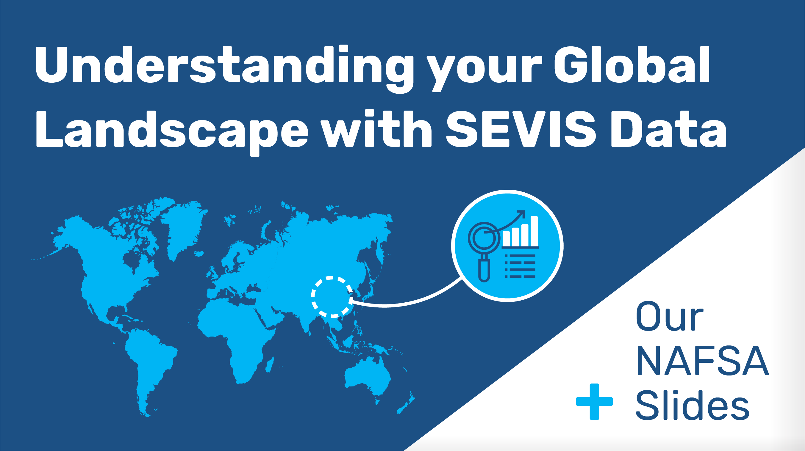
Below, you also will find a link to our NAFSA presentation slides about aligning your internal stakeholders and gaining the support you need to recruit. The stories shared by Jon Stauff (Monmouth University) and Martyn Miller (Temple University) gave some real world, in the trenches perspective. The slides really don’t capture all that was shared.
Please be in touch if you’d like to learn more (info@intead.com). Better yet, sign up for our new Intead Plus membership and get a continuous stream of helpful data, tools, and a Google Analytics review that can put you in a great position to strengthen your recruiting game.
Read on…
SEVIS stands for Student and Exchange Visitor Information System—the database that the Department of Homeland Security uses to track foreign students and exchange visitors in the U.S. But you knew that, right? This thing has been the bane of your existence for how long now…? But before you start grousing too much, take a look at the SEVIS mapping tool.
Mapping SEVIS by the Numbers is an interactive map that visualizes SEVIS data, allowing users to explore national and global trends. Let’s take a look at some of what you can do with it!
Explore from a U.S. or International Perspective
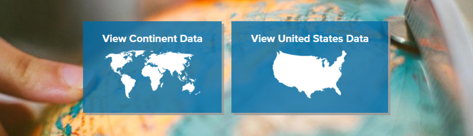
SEVIS allows you to choose from one of two starting points: “View Continent Data” or “View United States Data.”
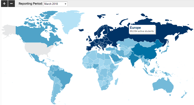
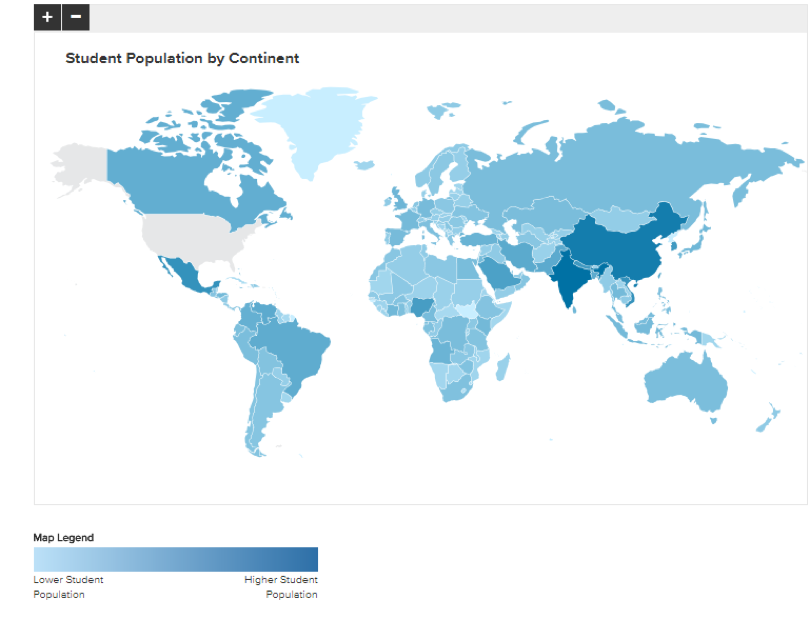
Continent Data
Continent Data shows you a world map. You can select a continent to see information about how many total students from that continent are in the U.S. during your selected reporting period.
You can see a further break-down of what program type students are enrolled in overall…
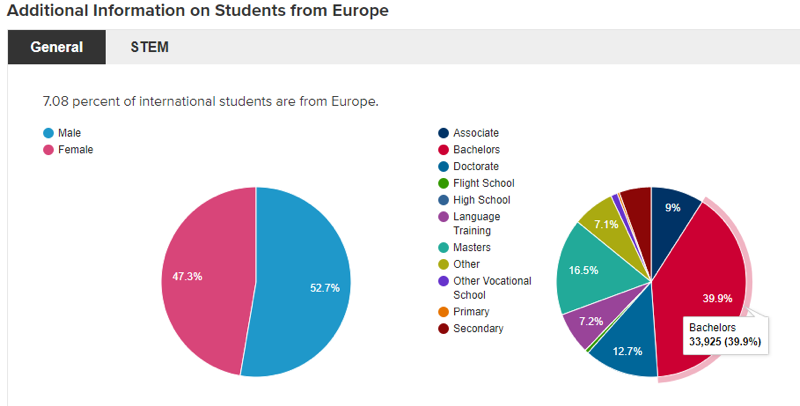
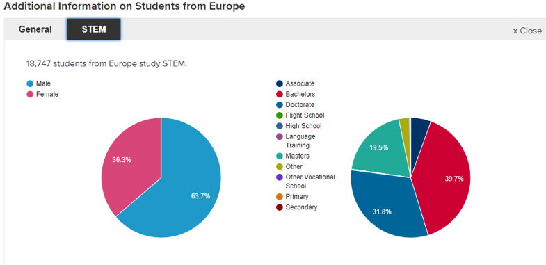
Or for STEM programs exclusively.
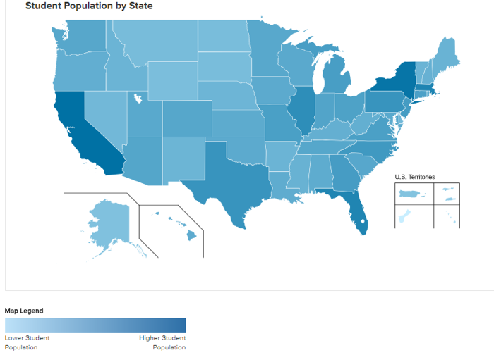
You can also see where students from that continent are studying in the U.S., using a handy heat map.
United States Data
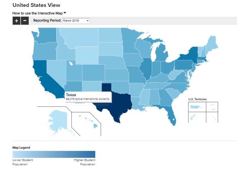
United States view shows you a U.S. map. You can select a state to see information about how many total international students are studying in your state in your selected reporting period.
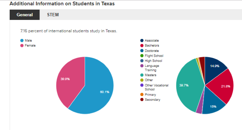
And just like in Continent View, you can check out what type of program students are enrolled in in that state—both in general, and for STEM exclusively.
You can also see where in the world students in that state hail from…
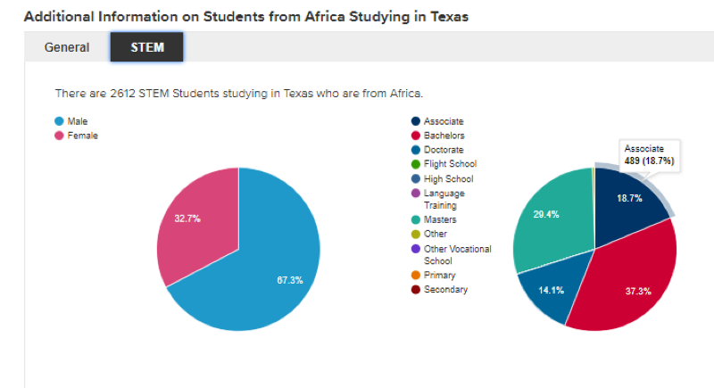
And then break down the data further. For example, looking at African students studying in Texas, what type of program are they enrolled in? Associates degrees are most popular.
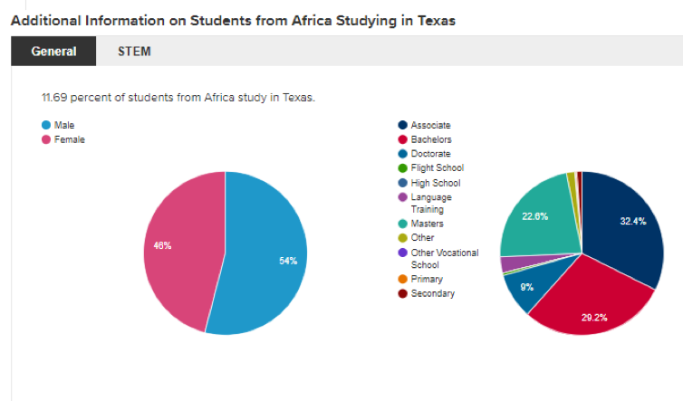
If you’d like to look just at STEM students from Africa studying in Texas, you can do that too!
Time Travel
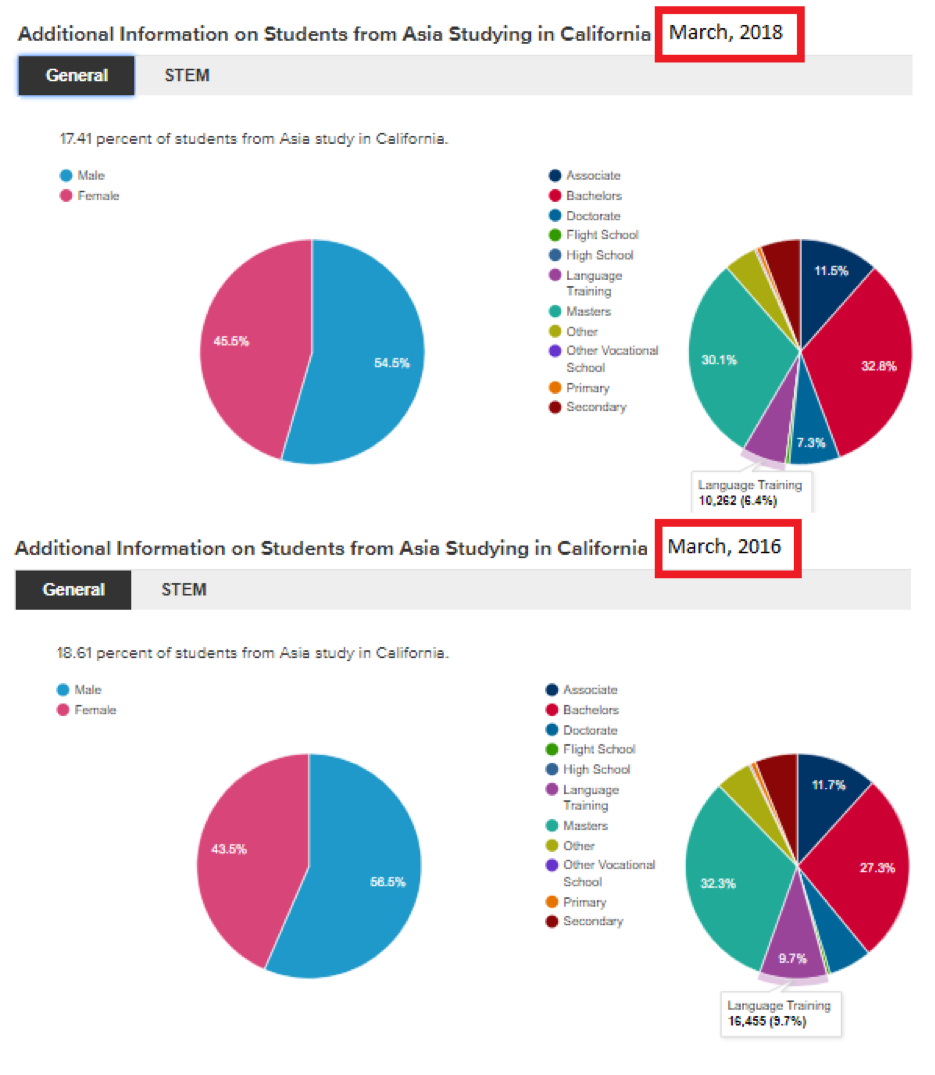
Another great feature of Mapping SEVIS by the Numbers is that you can explore past data. So, let’s say we’re working for a language program in California and interested in how well the state attracts Asian students to this type of program over the past few years.
Comparing results from March 2016 and March 2018, you can see that market is on a bit of a downswing, with about 6k fewer Asian students enrolled in language programs in CA at the 2018 date.
An Easy First Look
Mapping SEVIS by the Numbers gives you a quick and easy way to get a sense of broad industry trends, updated quarterly. Yes, it provides only broad strokes—but it does so awfully handily.
More granular data is available in the comprehensive SEVIS by the Numbers report which is released twice per year. Check out the latest SEVIS report, which was released in April. Don't miss the really great summary graphs showing student mobility trends there.
IIE is also a great resource for data. And if you want some insights into how global audiences are trending on a more personal level, Intead’s digital audit can help you track who is visiting your website and from where over time. The place to start for that is the new Intead Plus membership. Members get a discount on our digital audit in addition to the many other benefits.
#NAFSA 2018 Presentation Slides
If you missed our presentation at NAFSA, you can still scroll through out slides. As we mentioned above, the stories that go with them are what is really valuable. So, download the slides HERE. And be in touch (info@intead.com) so we can have our team show up on campus and hold one of our stakeholder workshops to help you align your team around all things international recruiting. We love doing this stuff.