Last week we shared stories of clients’ unexpected results from our analysis derived from data they had on hand. Insights that helped them improve their enrollment management and enhance recruitment channels they didn’t even know they had.
Success comes from translating your data into insights that point to actionable tasks to improve your operation, and your results.
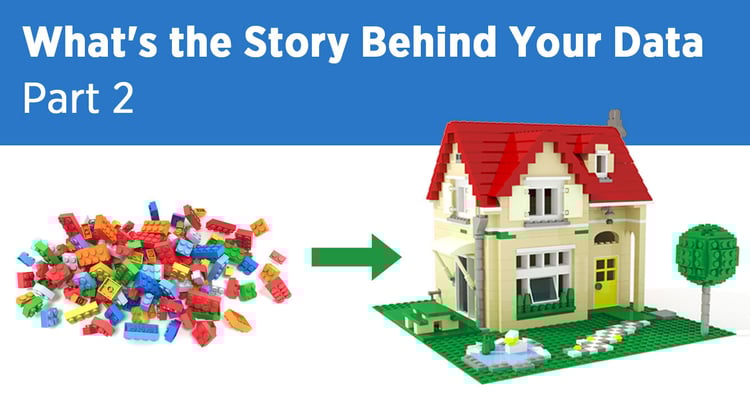
This is work that Patricia Tozzi, our Chief Strategy Officer, engages in every day with our team. In Part 2 of this blog series, she discusses more actionable steps around data translation. Those of you who have worked with her have seen the results. This week we focus on where to start.
Side note: if you’ll be attending the 2022 AIEA conference in New Orleans (Feb 20-23), be in touch and we’ll find time for a coffee and an exchange of ideas.
Read on for Patricia’s take on finding meaningful data and putting it to work…
Knowing how to find and then use the data you already have is a particularly valuable skill, especially now. We recognize the urgent need for a strong fall 2022 enrollment. New insights from the National Student Clearinghouse reveal that undergraduate student enrollment fell 6.6% from fall 2019. That’s the largest two-year decrease in over 50 years.
Worse still, community college enrollment is down 13% since fall 2019. Let’s not even talk about tightening budgets and student engagement on campus. Mental health concerns, anyone?
All that is to say, now is always the best time to dig into your institution’s data so you can determine the best next steps for your recruitment efforts. Good data is going to inform your work around student retention which has always been an issue but suddenly is getting a whole lot more attention.
Where to start?
- Define your goals
Your first step is to define your team’s immediate goal. It will help you formulate the initial questions you want data to answer. Are you seeking the mindset of prospective international students? A specific niche of domestic students? Do you need to better understand key pain points in the enrollment process? State a clear goal. - Find helpful data
We know there are challenges to collecting internal data – pieces tend to be spread out across departments and tech platforms, you don’t have access to it all, and it takes a good deal of energy and time. If that’s the case, start with what you have available now.
If you have access to Google Analytics and your CRM, start there. We’re sure you also read many industry reports (hopefully, some from Intead!) and other reputable sources like NCES, National Clearinghouse, IIE, etc., as they have macro data you can include in your storytelling.
Another tip? Check out Google Trends to see what people are searching for (topics, keywords per location). Trust us, there’s a lot of data to play with there. Try to stay focused on the task at hand when you go there. Your curiosity and playfulness will inevitably lure you down many rabbit holes (not necessarily a bad thing ; -) - Develop the story and share it (in an understandable format)
Once you define your goal, capture the data, and develop the story, share it with your team and beyond. The more awareness and understanding departments across campus have about what it reveals, the better.
Consider your student-facing personnel. Arm them with knowledge about your existing student population—what they value about your institution, the content with which they engage, and the like—so they become compelling brand storytellers to prospective students. Use data to help shape all student-facing touchpoints from larger efforts like ad campaigns, webinars, and recruitment trips to individual phone calls, texts, emails, and organic social posts.
Likewise, the more your marketing and communications team knows about your audience’s behavior—what’s working, what’s not—the more effective and creative they can be. Data storytelling reduces the sameness institutions often share (as opposed to differentiation that helps you stand out to your audience).
This effort to inform your team also dispels their personal preferences during the creative process and focuses efforts on the audience’s interests and style, what topics they want to consume, in what language, style, format, and on which platform. Personal preferences often offer insight and perspective but must be tempered by the actual audience preferences revealed by the data.
And don’t forget senior leaders. Data storytelling will help you train and coach them much better while also increasing your influence power. Your view of opportunities ahead will be clearer. You will be able to help others see further, too. - Distill your data with a dashboard. And DIY is a-ok.
Many of our clients appreciate data dashboards as a way of helping them make sense of their data. Yes, you can purchase amazing data analysis tools. But, you don’t have to. DIY dashboards will work and are a great way to consolidate your metrics. The main challenge clients face is knowing what they want to track and why. We recommend simply making a list of all the metrics or “things” you want to know about students. Sound easy? It can be.
More on building academic dashboards in our previous blog post here.
Caveat… because there’s always a but!
Clean, good-quality data is essential. Avoid misleading information at all costs. It is absolutely essential that you understand the metrics you’re using, e.g., how you identify first-time visitors vs. returning visitors, how to remove internal web traffic when analyzing external audience behaviors, and the like.
Also, it’s important to apply the right filters, use the appropriate time frame, and employ reputable sources. It's so easy to build a spreadsheet that conflates numbers or distorts the data. Take time to build it right with clean data so that your resulting story is true and accurate.
Tips for presenting data to others
Good data storytelling has a great narrative (beginning, middle, end) and visualization. Not everyone is a data geek or interested in getting into the weeds, so craft your story to the audience to whom you’re presenting.
You don’t want to flood your dean or president with too many charts or graphics without clear analysis and interpretation. Be clear about the tasks you’re recommending and the rationale. Align your team on the why behind the execution. As we discussed last week, you’ll want someone good in data analysis on your team to help you understand and then tell the story in a way others can grasp easily.
Finally, and very important: we all have our assumptions driven by our experience in the field, and that’s helpful at the beginning of the process. But be careful with what we call “confirmation bias” where you look for the story that will confirm what you believe or already think is true. That will undoubtedly result in misleading information and inaccurate correlations.
Our advice: show your story to a colleague or maybe test it with the audience you’re analyzing. Have them check your assumptions. Be receptive to feedback and learn from it (can be hard to do).
So, what story are you trying to tell? Let data lead the way. And if you need help pulling it all together, connect with us. We’ll be happy to help.